
ML From Scratch VI: Principal Component Analysis
In the previous article in this series we distinguished between two kinds of unsupervised learning (cluster analysis and dimensionality reduction) and discussed the former in some detail. In this installment we turn our attention to the later.
In dimensionality reduction we seek a function $f : \mathbb{R}^n \mapsto \mathbb{R}^m$ where $n$ is the dimension of the original data $\mathbf{X}$ and $m$ is less than or equal to $n$. That is, we want to map some high dimensional space into some lower dimensional space. (Contrast this with the map into a finite set sought by cluster analysis.)
We will focus on one technique in particular: Primary Component Analysis, usually abbreviated PCA. We’ll derive PCA from first principles, implement a working version (writing all the linear algebra code from scratch), show an example of how PCA helps us visualize and gain insight into a high dimensional data set, and end with a discussion a few more-or-less principled ways to choose how many dimensions to keep.
What is PCA?
PCA is a linear dimensionality reduction technique. Many non-linear dimensionality reduction techniques exist, but linear methods are more mature, if more limited.
Linearity does not suffice to fully specify the problem, however. Factor Analysis also seeks a linear map, but takes a more statistical approach and reaches a slightly different solution in practice. Non-negative matrix factorization seeks a linear map represented by a matrix with no negative elements - a restriction which PCA does not have.
I mention these other techniques to make the point that merely specifying that $f$ should be a linear map underspecifies the problem, and we need to be careful about what additional requirement we add if we’re going to end up with PCA instead of some other method.
Surprisingly, there are actually at least three different ways of fully specifying PCA, all of which seem very different at first but can be shown to be mathematically equivalent:
- Require the covariance matrix of the transformed data to be diagonal. This is equivalent to saying that the transformed data has no multicollinearity, or that all $m$ features of the transformed data are uncorrelated.
- Seek a new basis for the data such that the first basis vector points in the direction of maximum variation, or in other words is the “principle component” of our data. Then require that the second basis vector points also points in the direction of maximum variation in the plane orthogonal to the first, and so on until a new orthonormal basis is constructed.
- Seek a new basis for the data such that when we reconstruct the original matrix from only the $m$ most significant components the reconstruction error is minimized. Reconstruction error is usually defined as the Frobenius norm of the difference between the original and reconstructed matrix, but other definitions are possible.
That these very different motivations all lead to the same formal solution is reminiscent of the fact that the models of computation proposed independently by Turing, Church, and Gödel turned out to all be equivalent. Just as this triple convergence led some to believe that the definition of computation was discovered rather than merely invented, the fact that PCA keeps popping up suggests that it is in some fundamental way the “right” way to think about dimensionality reduction. Or maybe it just means mathematicians like to use linear algebra whenever they can, because non-linear equations are so difficult to solve. But I digress.
Under any of these three definitions, the linear map $f$ that we seek will turn out to be represented by a unique* (*some terms and conditions apply) orthogonal matrix $Q$.
Orthogonal matrices are the generalization of the 3-dimensional concept of a rotation or reflection: in particular they always preserve both distance and angles. These are ideal properties for a transform to have because merely rotating an object or holding it up to a mirror never distorts it, but simply gives us a different perspective on it.
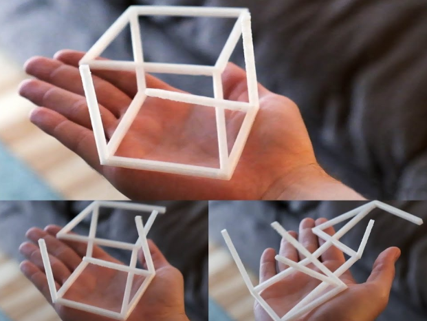
Imagine, for illustration’s sake that you held in your hand an unfamiliar object made of some easily deformable material like clay or soft plastic. You might turn it gently this way and that, peer at it from every angle, or hold it up to the mirror. But these delicate operations do no harm to the object - indeed, you don’t really need to touch the object at all! You’re merely changing your own point of view. Not so if you had flattened or stretched or twisted it; after these more violent operations any shape or pattern you perceive may well be the product of your own manipulations and not a true insight into the nature of the original form.
Orthogonal matrices are the safest and least distorting transformation that we could apply, and by the same token the most conservative and cautious. These are powerful virtues in a technique intended to help understand and explore data without misrepresenting it.
Now, obviously we could rotate our data any which way to get a different picture, but PCA does more: it rotates it so that in some sense in becomes aligned to the axes - rather like straightening a picture hanging askew on the wall. This is the property of PCA that is makes it so desirable for exploratory analysis.
Orthogonal matrices are always square, so $Q$ is an $m \times m$ matrix. But multiplying by a square matrix doesn’t reduce the dimensionality at all! Why is this considered a dimensionality reduction technique? Well, it turns out that once we’ve rotated our data so that it’s as wide as possible along the first basis vector, that also means that it ends up as thin as possible along the last few basis vectors. This only works if the original data really were all quite close to some line or hyperplane, but with this assumption met we can safely drop the least significant dimensions and retain only our principle components, thus reducing dimensionality while keeping most of the information (variance) of the data. Of course, deciding exactly how many dimensions to drop/retain is a bit tricky, but we’ll come to that later.
For now, let’s explore the mathematics and show how PCA gives rise to a unique solution subject to the above constraints.
Approach #1: The Direction of Maximal Variation
Before we can define the direction of maximal variance, we must be clear about what we mean by variance in a given direction. First, let’s say that $\mathbf{x}$ is an $n$-dimensional random vector. This represents the population our data will be sampled from. Next, suppose you have some non-random vector $\mathbf{q} \in \mathbb{R}^n$. Assuming this vector is non-zero, it defines a line. What do mean by the phrase, “the variance of $\mathbf{x}$ in the direction of $\mathbf{q}$?”
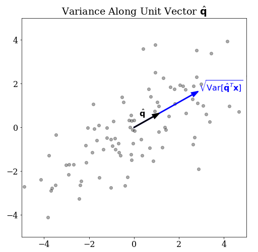
The natural thing to do is to project the $n$-dimensional random variable onto the line defined by $\mathbf{q}$. We can do this with a dot product which we will write as the matrix product $\mathbf{q}^T \mathbf{x}$. This new quantity is clearly a scalar random variable, so we can apply the variance operator to get a scalar measure of variance.
$$ \operatorname{Var}[ \mathbf{q}^T \mathbf{x} ] \tag{1} $$
Does this suffice to allow us to define a direction of maximal variation? Not quite. If we try to pose the naive optimization problem:
$$ \underset{\mathbf{q}}{\operatorname{argmax}} \operatorname{Var}[ \mathbf{q}^T \mathbf{x} ] \tag{2} $$
We can easily prove no solution exists. Proof: Assume that $\mathbf{a}$ is the maximum. There always exists another vector $\mathbf{b} = 2 \mathbf{a}$ which implies that:
$$\operatorname{Var}[ \mathbf{b}^T \mathbf{x}] = 4 \operatorname{Var}[ \mathbf{a}^T \mathbf{x} ] > \operatorname{Var}[ \mathbf{a}^T \mathbf{x} ] \tag{3}$$.
Which implies that $\mathbf{a}$ was not the maximum after all, which is absurd. Q.E.D. The upshot is that we must impose some additional constraint.
Recall that a dot product is only a projection in a geometric sense if $\mathbf{q}$ is a unit vector. Why don’t we impose the condition
$$ \mathbf{q}^T \mathbf{q} = 1 \tag{4} $$
To obtain the constrained optimization problem
$$ \underset{\mathbf{q}}{\operatorname{argmax}} \operatorname{Var}[ \mathbf{q}^T \mathbf{x} ] \quad\quad \text{such that} \, \mathbf{q}^T \mathbf{q} = 1 \tag{5} $$
Well at least this has a solution, even if it isn’t immediately obvious how to solve it. We can’t simply set partial derivative with respect to $\mathbf{q}$ equal to zero; that KKT condition only applies in the absence of active constraints. Earlier in this series, we’ve used techniques such as stochastic gradient descent to solve unconstrained optimization problems, but how do we deal the constraint?
An Ode to Lagrange Multipliers
Happily, a very general and powerful trick exists for translating constrained optimization problems into unconstrained ones: the method of Lagrange multipliers. In 1780, Lagrange was studying the motion of constrained physical systems. At the time, such problems were usually solved by finding a suitable set of generalized coordinates but this required a great deal of human ingenuity.
As a concrete illustration, consider a bead on a stiff, bent wire.
The bead moves in all three dimensions and therefore requires three coordinates $x$, $y$, and $z$ to describe its position. However, it is also constrained to the one dimensional path imposed by the shape of the wire so in theory its position could be described by a single parameter $t$ describing its position along the bent path. However, for a very complex path this might be hard to do, and even harder to work with when calculating the momentum and energy necessary to describe the dynamics of the system.
Lagrange developed a method by which this could always be done in an essentially mechanical way, requiring no human insight. As just one example, the technique is used in modern physics engines - as new contact points are added or removed as objects touch in different ways, the physics engine can dynamically add or remove constraints to model them without ever having to worry about finding an appropriate set of generalized coordinates.
Lagrange’s genius was to imagine the system could “slip” just ever so slightly out of its constraints and that the true solution would be the one that minimized this virtual slippage. This could be elegantly handled by associating an energy cost called ‘virtual work” that penalized the system proportional to the degree to which the constraints were violated. This trick reconceptualizes a hard constraint as just another parameter to optimize in an unconstrained system! And surprisingly enough, it does not result in an approximate solution that only sort of obeys the constraint but instead (assuming the constraint is physically possible and the resulting equations have a closed form solution) gives an exact solution where the constraint is perfectly obeyed.
It’s easy to use too, at least in our simple case. We introduce the Lagrange multiplier $\lambda$ and rewrite our optimization as follows:
$$ \underset{\mathbf{q} ,\, \lambda}{\operatorname{argmax}} \operatorname{Var}[ \mathbf{q}^T \mathbf{x} ] + \lambda (1 - \mathbf{q}^T \mathbf{q}) \tag{6} $$
Why is this the same as the above? Let’s call the above function $f(\mathbf{q}, \lambda)$ write down the KKT conditions:
$$
\begin{align}
\nabla_\mathbf{q} f & = 0 \tag{7}
\frac{\partial f}{\partial \lambda} & = 0 \tag{8}
\end{align}
$$
But equation (8) is simply $\mathbf{q}^T \mathbf{q} - 1 = 0$ which is simply our unit vector constraint… this guarantees that when we solve (7) and (8), the constraint will be exactly satisfied and we’ll will also have found a solution to (6). Such is the magic of Lagrange multipliers.
But if (8) is just our constraint in a fancy new dress, how have we progressed at all? Because (7) is now unconstrained (and therefore more tractable!)
Finding the Direction of Maximal Variation
Suppose the matrix $\mathbf{X}$ is an $N \times n$ matrix with $N$ rows where each row vector is an independent realization of $\mathbf{x}$. Also assume (without loss of generality) that the mean of each column of $\mathbf{X}$ is zero. (This can always be accomplished by simply subtracting off a mean vector $\mathbf{\mu}$ before applying PCA.)
We can estimate the covariance matrix of $\mathbf{X}$ as
$$ \mathbf{C} = \frac{\mathbf{X}^T \mathbf{X}}{n} \tag{9} $$
$$ f = \mathbf{q}^T \mathbf{C} \mathbf{q} + \lambda (1 - \mathbf{q}^T \mathbf{q}) \tag{10} $$
$$ \nabla f = 2 \mathbf{C} \mathbf{q} - 2 \lambda \mathbf{q} \tag{11} $$
Dividing by two and moving each term to opposite sides of the equation, we get the familiar equation for the eigenproblem:
$$ \mathbf{C} \mathbf{q} = \lambda \mathbf{q} \tag{12} $$
This shows that every “direction of maximal variation” is in fact an eigenvector of the covariance matrix, and the variance in that direction is the corresponding eigenvalue.
Because the covariance matrix $\mathbf{C}$ is real-valued, symmetric, and positive definite, we know that the eigenvalues will all be real-valued (as expected.)
Thus, to find the axes of maximal variation, it suffices to find the eigendecomposition of $\mathbf{C}$.
Define $\mathbf{Q}$ to be the $n \times n$ right eigenvalue matrix (meaning each column is an eigenvector) and $\mathbf{\Lambda}$ is the diagonal $n \times n$ matrix containing eigenvalues along the diagonal.
$$ \mathbf{C} = \mathbf{Q} \mathbf{\Lambda} \mathbf{Q}^T \tag{13} $$
We will discuss the algorithm necessary to compute $\mathbf{Q}$ and $\mathbf{\Lambda}$ below, but first let’s discuss some alternative ways to motivate PCA.
Approach #2: Diagonalizing the Covariance Matrix
We could have skipped the entire “direction of maximal variation” and Lagrange multiplier argument if we had simply argued as follows: I want my features to be uncorrelated. Which is to say, I want the covariance matrix of my data to be diagonal. However, when I estimate the covariance matrix for my data in their original form, I see that the covariance matrix is not diagonal. That means my original features exhibit some multiple collinearity, which is bad. To fix this problem, I will transform my data in such a way as make the covariance matrix diagonal. It is well-known that a matrix can be diagonalized by finding its eigendecomposition. Therefore, I need to find the eigendecomposition $\mathbf{C} = \mathbf{Q} \mathbf{\Lambda} \mathbf{Q}^T$.
The resulting right eigenvector matrix $\mathbf{Q}$ can be applied to $X$, yielding a new, transformed data set $\mathbf{X}‘$.
$$ \mathbf{X}’ = \mathbf{X} \mathbf{Q} \tag{14} $$
When we then estimate the empirical covariance of $\mathbf{X}‘$, we find
$$ \begin{align}
\mathbf{C}’ & = \frac{\mathbf{X}‘^T \mathbf{X}‘}{n} \tag{15}
& = \frac{(\mathbf{X}\mathbf{Q})^T (\mathbf{X}\mathbf{Q})}{n}
& = \frac{\mathbf{Q}^T \mathbf{X}^T \mathbf{X}\mathbf{Q}}{n}
& = \mathbf{Q}^T \Bigg( \frac{\mathbf{X}^T \mathbf{X}}{n} \Bigg) \mathbf{Q}
& = \mathbf{Q}^T \mathbf{C} \mathbf{Q}
& = \mathbf{\Lambda}
\end{align}
$$
Because $\mathbf{\Lambda}$ is a diagonal matrix, we’ve shown that the empirical covariance of our transformed data set is diagonal; which is to say, all of the features of $X’$ are independent.
This argument is much more brutish and perhaps too on the nose: we wanted a diagonal covariance matrix, so we diagonalized it, anyone got a problem with that? However, it has the advantage of requiring nothing more than linear algebra: no statistics, multivariate calculus, or optimization theory here! All we need is a common-sense attitude toward working with data, or what my boss sometimes calls “street statistics.”
A Brief Aside About Loadings
At this point it may also be worth mentioning that multiplying by the left eigenvector matrix $\mathbf{Q}$ is only one of two common ways to define the transformed data $\mathbf{X}‘$. Alternatively, we could have used the so-called “loadings” matrix, defined like so:
$$ \mathbf{L} = \mathbf{Q} \sqrt{\mathbf{\Lambda}} \tag{16} $$
The square root of a matrix may seem strange to you, but recall that $\mathbf{\Lambda}$ is diagonal, so this just means the element-wise square root of each eigenvalue. Using $\mathbf{L}^{-1}$ instead of $\mathbf{Q}$ to transform from $\mathbf{X}$ to $\mathbf{X}‘$ means the empirical covariance matrix of the transformed data will be the identity matrix. This can be more intuitive in some cases. Also, many software packages report the loading matrix instead of the eigenvectors on the basis that they are easier to interpret.
Approach #3: Minimizing Reconstruction Error
The third and final way to motivate the mathematical formalism of PCA is to view it as a form of compression. Specifically, of all possible linear projections from $n$ to $m$ dimensions, taking the first $k$ components of the PCA transformation of $X$ minimizes the reconstruction error. Reconstruction error is usually defined as the Frobenius distance between the original and reconstructed matrix but interestingly enough the theorem holds for a few other metrics as well, suggesting it’s a deep property of PCA and not some quirk of the Frobenius norm.
I won’t go through this derivation here - you can find a presentation elsewhere if you’re interested in the details - but it’s an extremely powerful point of view which goes straight to the heart of the dimensional reduction strategy. If we can reconstruct our original data almost exactly from only a handful of components that lends strong support to the notion that any interesting information about the image must have been contained in those few components.
Consider this series of images, taken from this article:
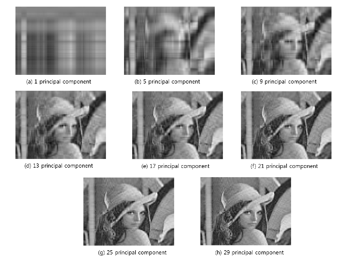
Here, 512 dimensions was reduced to just 29, but the reconstructed image is still perfectly recognizable.
With three separate theoretical justifications under our belt - which is two too many to be honest - let’s turn our attention to the concrete problem of implementing eigendecomposition from scratch.
Algorithm for Solving the Eigenproblem
The modern approach to implementing PCA is to find the Singular Value Decomposition of a matrix $A$ which almost immediately gives us the eigenvalues of and eigenvectors of $A^T A$. The best known SVD algorithm is the Golub-Reinsh Algorithm. This is an iterative algorithm. Starting with $A_1 = A$ we calculate $A_{k+1}$ from $A_k$ until we achieve convergence.
For each step we first use Householder reflections to reduce the matrix to bidiagonal form $A_k$, then use a QR decomposition of $X_k^T X_k$ to set many of the off-diagonal elements to zero. The resulting matrix $A_{k+1}$ is tridiagonal, but at each step the off-diagonal elements get smaller and smaller. This is very much like trying to get rid of all the air bubbles in wallpaper by flattening them with a stick, only to have new bubbles pop up. However, the off-diagonal elements introduced by the process are smaller on average than the original and it can be proved to converge to zero even if they will never be exactly zero. In practice this converge is extremely rapid for well-conditioned matrices.
There is also a randomized algorithm due to Halko, Martinsson, and Tropp which can be much faster, especially when we only want to retain a small number of components. This is commonly used with very large sparse matrices.
Normally I would tackle one of these “best practice” algorithms, but after studying them I found them to be larger in scope than what I would want to tackle for one of these articles. Instead, I decided to implement an older but still quite adequate eigenvalue algorithm: known as the QR algorithm. In addition to being easy to understand and implement, it has the advantage that we can use the QR decomposition function that we implemented in the earlier article on linear regression. It’s just as fast or faster than Golub-Reinsh; the disadvantage is that it is not as numerically stable particularly for the smallest eigenvalues. Because in PCA we normally intend to discard these anyway, this is not such a bad deal!
Recall from that previous article our implementations for Householder reflections and QR decompositions:
def householder_reflection(a, e):
    '''
    Given a vector a and a unit vector e,
    (where a is non-zero and not collinear with e)
    returns an orthogonal matrix which maps a
    into the line of e.
    '''

    assert a.ndim == 1
    assert np.allclose(1, np.sum(e**2))

    u = a - np.sign(a[0]) * np.linalg.norm(a) * e
    v = u / np.linalg.norm(u)
    H = np.eye(len(a)) - 2 * np.outer(v, v)

    return H


def qr_decomposition(A):
    '''
    Given an n x m invertable matrix A, returns the pair:
        Q an orthogonal n x m matrix
        R an upper triangular m x m matrix
    such that QR = A.
    '''

    n, m = A.shape
    assert n >= m

    Q = np.eye(n)
    R = A.copy()

    for i in range(m - int(n==m)):
        r = R[i:, i]

        if np.allclose(r[1:], 0):
            continue

        # e is the i-th basis vector of the minor matrix.
        e = np.zeros(n-i)
        e[0] = 1

        H = np.eye(n)
        H[i:, i:] = householder_reflection(r, e)

        Q = Q @ H.T
        R = H @ R

    return Q, R
Using these we can implement the QR algorithm in just a few lines of code.
The QR algorithm is iterative: at each step, we calculate $A_{k+1}$ by taking the QR decomposition of $A_{k}$, reversing the order of Q and R, and multiplying the matrices together. Each time we do this, the off-diagonals get smaller.
def eigen_decomposition(A, max_iter=100):
    A_k = A
    Q_k = np.eye( A.shape[1] )

    for k in range(max_iter):
        Q, R = qr_decomposition(A_k)
        Q_k = Q_k @ Q
        A_k = R @ Q

    eigenvalues = np.diag(A_k)
    eigenvectors = Q_k
    return eigenvalues, eigenvectors
Implementing PCA
We made a number of simplifying assumptions in the above theory and now we have to pay with a corresponding amount of busywork to get our data into an idealized form. There are really two pieces of book-keeping to implement:
- We need to ensure than the data are centered
- Optionally “whiten” the data so that each feature has unit variance
- put eigenvalues in descending order
Aside from these considerations, the entire fit() function is little more
than the handful of lines necessary to diagonalize the empirical covariance
matrix. All of the hard work is done inside eigen_decomposition().
class PCA:
    def __init__(self, n_components=None, whiten=False):
        self.n_components = n_components
        self.whiten = bool(whiten)

    def fit(self, X):
        n, m = X.shape

        # subtract off the mean to center the data.
        self.mu = X.mean(axis=0)
        X = X - self.mu

        # whiten if necessary
        if self.whiten:
            self.std = X.std(axis=0)
            X = X / self.std

        # Eigen Decomposition of the covariance matrix
        C = X.T @ X / (n-1)
        self.eigenvalues, self.eigenvectors = eigen_decomposition(C)

        # truncate the number of components if doing dimensionality reduction
        if self.n_components is not None:
            self.eigenvalues = self.eigenvalues[0:self.n_components]
            self.eigenvectors = self.eigenvectors[:, 0:self.n_components]

        # the QR algorithm tends to puts eigenvalues in descending order
        # but is not guarenteed to. To make sure, we use argsort.
        descending_order = np.flip(np.argsort(self.eigenvalues))
        self.eigenvalues = self.eigenvalues[descending_order]
        self.eigenvectors = self.eigenvectors[:, descending_order]

        return self

    def transform(self, X):
        X = X - self.mu

        if self.whiten:
            X = X / self.std

        return X @ self.eigenvectors

    @property
    def proportion_variance_explained(self):
        return self.eigenvalues / np.sum(self.eigenvalues)
Wine Quality Example
The wine quality data set consists of 178 wines, each described in terms of 13 different objectively quantifiable chemical or optical properties such as the concentration of alcohol or the hue and intensity of the color. Each has been assigned to one of three possible classes depending on a subjective judgement of quality.
Thirteen dimensions isn’t nearly as bad as the hundreds or thousands commonly encountered in machine learning, but still rather more than the handful we poor 3-dimensional creatures are comfortable thinking about. We’d like to get that down to something manageable, certainly no more than three. So some kind of dimensionality reduction is indicated.
import pandas as pd
import seaborn
import matplotlib.pyplot as plt
from mpl_toolkits.mplot3d import Axes3D

from sklearn.datasets import load_wine

wine = load_wine()
X = wine.data

df = pd.DataFrame(data=X, columns=wine.feature_names)
display(df.head().T)
A sample of the first five wines in the dataset:
| #1 | #2 | #3 | #4 | #5 | |
|---|---|---|---|---|---|
| alcohol | 14.23 | 13.2 | 13.16 | 14.37 | 13.24 |
| malic_acid | 1.71 | 1.78 | 2.36 | 1.95 | 2.59 |
| ash | 2.43 | 2.14 | 2.67 | 2.5 | 2.87 |
| alcalinity_of_ash | 15.6 | 11.2 | 18.6 | 16.8 | 21 |
| magnesium | 127 | 100 | 101 | 113 | 118 |
| total_phenols | 2.8 | 2.65 | 2.8 | 3.85 | 2.8 |
| flavanoids | 3.06 | 2.76 | 3.24 | 3.49 | 2.69 |
| nonflavanoid_phenols | 0.28 | 0.26 | 0.3 | 0.24 | 0.39 |
| proanthocyanins | 2.29 | 1.28 | 2.81 | 2.18 | 1.82 |
| color_intensity | 5.64 | 4.38 | 5.68 | 7.8 | 4.32 |
| hue | 1.04 | 1.05 | 1.03 | 0.86 | 1.04 |
| od280/od315_of_diluted_wines | 3.92 | 3.4 | 3.17 | 3.45 | 2.93 |
| proline | 1065 | 1050 | 1185 | 1480 | 735 |
These data have two characteristics that we should consider carefully.
First, we can see that the features of this dataset are not on the same scale; proline in particular is a thousand times greater than the others. That strongly suggests that we should “whiten” the data (scale everything so that each feature has unit variance before applying PCA.) Here, just for the purposes of this visualization, we will manually whiten the data.
X_white = (X - X.mean(axis=0))/X.std(axis=0)
C = X_white.T @ X_white / (X_white.shape[0] - 1)
plt.figure(figsize=(6,6))
plt.imshow(C, cmap='binary')
plt.title("Covariance Matrix of Wine Data")
plt.xticks(np.arange(0, 13, 1))
plt.yticks(np.arange(0, 13, 1))
plt.colorbar()
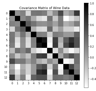
Second, it is clear from this plot that this dataset exhibits significant multicollinearity. Every feature exhibiting high correlations with several others; no feature is truly independent. While that would be a bad thing for say, linear regression, it means these data are an ideal candidate for PCA.
pca = PCA(whiten=True)
pca.fit(X)
X_prime = pca.transform(X)
From the eigenvalues, we can see that the first few components explain most of the variance:
pca.eigenvalues
array([4.732, 2.511, 1.454, 0.924, 0.858, 0.645,
       0.554, 0.350, 0.291, 0.252, 0.227, 0.170,  0.104])
The raw eigenvectors are hard to interpret directly, but if you like you can read the columns (starting with the leftmost) and see which features are being rolled up into each component; for example, it seems that “flavanoids” and “phenols” (whatever those are) are major contributors to the first principle component, among others, while “ash” contributes almost nothing to it.
pca.eigenvectors

array([[ 0.144, -0.484, -0.207,  0.018,  0.266,  0.214, -0.056,  0.396, -0.509, -0.212,  0.226,  0.266, -0.015],
       [-0.245, -0.225,  0.089, -0.537, -0.035,  0.537,  0.421,  0.066,  0.075,  0.309, -0.076, -0.122, -0.026],
       [-0.002, -0.316,  0.626,  0.214,  0.143,  0.154, -0.149, -0.17 ,  0.308,  0.027,  0.499,  0.05 ,  0.141],
       [-0.239,  0.011,  0.612, -0.061, -0.066, -0.101, -0.287,  0.428, -0.2  , -0.053, -0.479,  0.056, -0.092],
       [ 0.142, -0.3  ,  0.131,  0.352, -0.727,  0.038,  0.323, -0.156, -0.271, -0.068, -0.071, -0.062, -0.057],
       [ 0.395, -0.065,  0.146, -0.198,  0.149, -0.084, -0.028, -0.406, -0.286,  0.32 , -0.304,  0.304,  0.464],
       [ 0.423,  0.003,  0.151, -0.152,  0.109, -0.019, -0.061, -0.187, -0.05 ,  0.163,  0.026,  0.043, -0.832],
       [-0.299, -0.029,  0.17 ,  0.203,  0.501, -0.259,  0.595, -0.233, -0.196, -0.216, -0.117, -0.042, -0.114],
       [ 0.313, -0.039,  0.149, -0.399, -0.137, -0.534,  0.372,  0.368,  0.209, -0.134,  0.237,  0.096,  0.117],
       [-0.089, -0.53 , -0.137, -0.066,  0.076, -0.419, -0.228, -0.034, -0.056,  0.291, -0.032, -0.604,  0.012],
       [ 0.297,  0.279,  0.085,  0.428,  0.173,  0.106,  0.232,  0.437, -0.086,  0.522,  0.048, -0.259,  0.09 ],
       [ 0.376,  0.164,  0.166, -0.184,  0.101,  0.266, -0.045, -0.078, -0.137, -0.524, -0.046, -0.601,  0.157],
       [ 0.287, -0.365, -0.127,  0.232,  0.158,  0.12 ,  0.077,  0.12 ,  0.576, -0.162, -0.539,  0.079, -0.014]])
Just as a cross check, we can plot the covariance matrix of the transformed data the same way we did the raw data above:
plt.figure(figsize=(6,6))
plt.imshow(C_prime, cmap='binary')
plt.title("Covariance Matrix of Transformed Data")
plt.xticks(np.arange(0, 13, 1))
plt.yticks(np.arange(0, 13, 1))
plt.colorbar()
![]()
And we can see the expected structure: eigenvalues descending from 4.7 to 0.1 along the diagonal, and exactly 0 away from the diagonal.
Visualizing the Components
PCA was applied only to the 13 features; the partition into three quality classes was not included. Still, we would like to know if the primary components have something to say about these classes, so we will color code them with red, green, and blue.
Let’s start by visualizing only the first component as points along a line:
plt.figure(figsize=(10, 4))
for c in np.unique(wine.target):
    color = ['red', 'green', 'blue'][c]
    X_class = X_prime[wine.target == c]
    plt.scatter(X_class[:, 0], X_class[:, 1]*0, color=color, alpha=0.3)
plt.title("Primary Components of Wine Quality")
plt.xlabel("PC1")
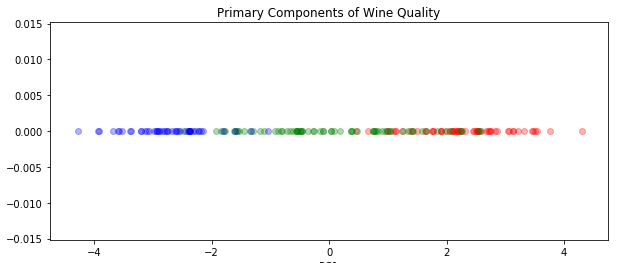
This may seem a little silly, but in fact boiling it down to only a single component is often the best option: if you can boil a phenomenon down to a single number in a way that captures the essence, that could be very useful and in some cases represents an important discovery. For example, the reason we can talk about “mass” without clarifying “inertial mass” vs. “gravitational mass” is because we strongly believe those quantities are identical in all cases. Is it possible that wine is neither complex nor multidimensional, but simply exists along a spectrum from poor to good quality?
However, in this case, it seems like the first principle component does not fully capture the concept of quality. Let’s try plotting the first two components.
plt.figure(figsize=(10, 8))
for c in np.unique(wine.target):
    color = ['red', 'green', 'blue'][c]
    X_class = X_prime[wine.target == c]
    plt.scatter(X_class[:, 0], X_class[:, 1], color=color, alpha=0.6)
plt.title("Primary Components of Wine Quality")
plt.xlabel("PC1")
plt.ylabel("PC2")
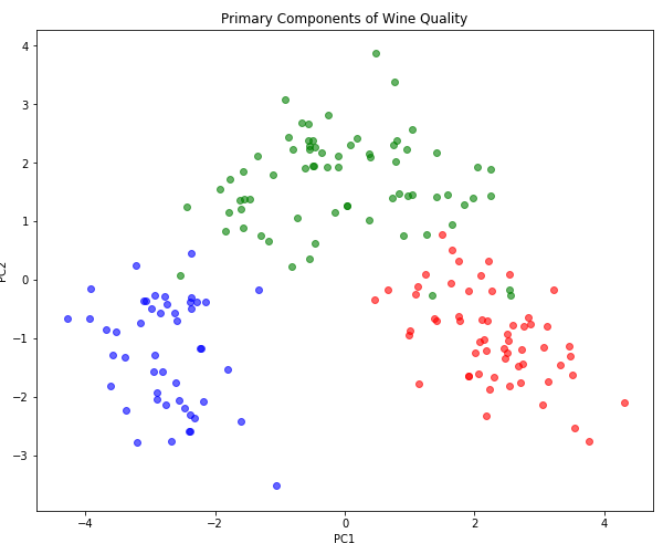
Now we can see that each class corresponds to a well-localized cluster with little overlap. In many cases, where PC1 is right on the boundary between two classes, it is PC2 that supplies the tiebreaker. Note that we could draw a single curved path that would connect these three regions in order or ascending quality; this suggests that a non-linear dimensionality reduction technique, say some kind of manifold learning like t-SNE, might be able to reduce quality to a single dimension. But is that the representation it would discover on its own, when trained in an unsupervised manner?
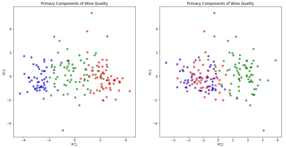
It may also be worth trying three dimensions, just in case PC3 has some non-ignorable contribution to quality. Three dimensions is always a little hard to visualize with standard plotting tools, but we can use pairwise 2D plots:
plt.figure(figsize=(16, 8))

plt.subplot(1, 2, 1)
for c in np.unique(wine.target):
    color = ['red', 'green', 'blue'][c]
    X_class = X_prime[wine.target == c]
    plt.scatter(X_class[:, 0], X_class[:, 2], color=color, alpha=0.6)
plt.title("Primary Components of Wine Quality")
plt.xlabel("PC1")
plt.ylabel("PC3")

plt.subplot(1, 2, 2)
for c in np.unique(wine.target):
    color = ['red', 'green', 'blue'][c]
    X_class = X_prime[wine.target == c]
    plt.scatter(X_class[:, 1], X_class[:, 2], color=color, alpha=0.6)
plt.title("Primary Components of Wine Quality")
plt.xlabel("PC2")
plt.ylabel("PC3")
Or the kind of plot which is called 3D, although it’s really just a slightly more sophisticated projection on 2D:
fig = plt.figure(figsize=(10, 8))
ax = fig.add_subplot(111, projection='3d')
ax.view_init(15, -60)

for c in np.unique(wine.target):
    color = ['red', 'green', 'blue'][c]
    X_class = X_prime[wine.target == c]
    ax.scatter(X_class[:, 0], X_class[:, 1], X_class[:, 2], color=color, alpha=0.6)

# chart junk
plt.title("First 3 Primary Components of Wine Quality")
ax.set_xlabel('PC1')
ax.set_ylabel('PC2')
ax.set_zlabel('PC3')
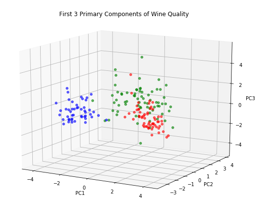
While these charts look attractive enough, they don’t seem to make a compelling case for including PC3. At least for the purposes of understanding wine quality it seems we can retain just two principle components and still get a complete picture.
At this point in a real analysis, we would spend some time understanding what PC1 and PC2 really represent, looking at which of the 13 original features contribute to each, and whether positive or negative, and how this relates to quality. But there is an elephant in the room - the informal or seemingly ad hoc method I used for deciding to use two components instead of one or three. While “just look at the data and use the one that makes sense” has a certain pragmatic and commonsensical appeal, it’s also easy to see that it’s subjective enough to allow bias to creep in. As such, many people have asked themselves if there were not some rigorous decision rule that could be applied.
Strategies for Choosing The Number of Dimensions
The oldest and most venerable method involves plotting the eigenvalues in descending order as a function of dimension number: whimsically called a scree plot after a resemblance to the “elbow” that appears near the base of some mountain where loose stones are piled upon a slope:

To determine the number of components to retain, it is suggested to look for a visual “elbow” point at which the chart noticeably flattens out and use that for the cut-off.
Alternatively, if a deterministic rule is required, one might use so-called the Kaiser criterion : drop all components with an eigenvalue less than 1 and retain all those with an eigenvalue greater than 1.
Before discussing the merits or demerits of these approaches, let’s just create the scree plot for the wine quality data set:
fig = plt.figure(figsize=(10, 7))
plt.title("Scree Plot (Eigenvalues in Decreasing Order)")
plt.plot([1, 13], [1, 1], color='red', linestyle='--', label="Kaiser Rule")
plt.xticks(np.arange(1, 14, 1))
plt.xlim(1, 13)
plt.ylim(0, 5)
plt.ylabel("Eigenvalue")
plt.xlabel("Principle Component Index")
plt.grid(linestyle='--')
plt.plot(range(1, 14), pca.eigenvalues, label="Eigenvalues")
plt.legend()
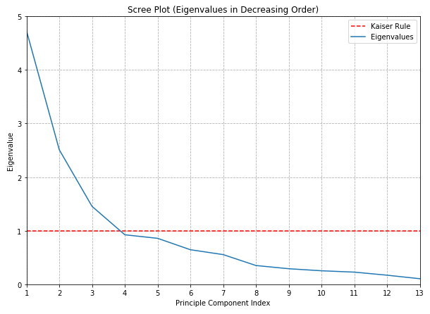
In this case, no prominent elbow is apparent, at least to my eyes. This is disappointing but not surprising: whenever I’ve tried to use this rule in my work I’ve found it to be at least somewhat ambiguous - and liable to influenced by irrelevant things such as the aspect ratio of the chart!
The Kaiser criterion, on the other hand, is a complete train wreck and ultimately is no more likely to protect you from criticism than simply asserting that you used your best judgement.
Another approach is to decide before hand that you want to retain some fraction of the total variance, say 80% or 99%, and choose a number of components which give you the desired fidelity. (This approach is particularly attractive if you have the “compression” point-of-view in mind.) Although the proportion of variance explained is calculated from the same eigenvalues used for the scree plot, the difference here is that we are now looking at the cumulative sum of eigenvalues.
fig = plt.figure(figsize=(10, 7))
plt.title("Variance Explained By Component")
plt.xticks(np.arange(1, 14, 1))
plt.yticks(np.arange(0, 1.0001, 0.1))
plt.xlim(1, 13)
plt.ylim(0, 1)
plt.ylabel("Proportion of Variance Explained")
plt.xlabel("Principle Component Index")
plt.grid(linestyle='--')
plt.fill_between(
    range(1, 14),
    np.cumsum(pca.proportion_variance_explained),
    0,
    color="lightblue",
    label="Cumulative")
plt.plot(
    range(1, 14),
    np.cumsum(pca.proportion_variance_explained),
    0,
    color="darkblue")
plt.plot(
    range(1, 14),
    pca.proportion_variance_explained,
    label="Incremental",
    color="orange",
    linestyle="--")
plt.legend(loc='upper left')
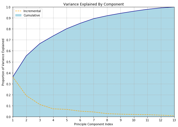
One benefit of this approach is that it is much easier to explain; one does not need to use term “eigen” at all! People familiar with ANOVA will be comfortable with the concept of “proportion of variance explained” and this can even be glossed as “information” for audiences where even the word “variance” might be a little scary. “We used PCA to compress the data from 512 to 29 dimensions while retaining 95% of the information” may be criticized for not using the information theoretic definition of “information” but is clear enough to a broad audience.
Still, we haven’t really solved the issue of having to choose an arbitrary threshold, have we? All we’ve done is couch the choice in terms of a more intuitive metric. I’m not sure any definitive and universally accepted answer exists - but the wonderfully named paper Repairing Tom Swift’s Electric Factor Analysis Machine suggests one method, and I’ve seen several references to this paper by Minka which may represent the current state-of-the-art.
Conclusion
PCA is the archetypical dimensionality reduction method; just as $k$-means is the archetypical clustering method. Now that we’ve implemented both a dimensional reduction and a clustering method (in the last article) from scratch, we should have a pretty good handle on the basics of unsupervised learning. In particular, we’ve seen many of the frustration and limitations inherent in unsupervised methods, which boil down to the impossibility of objectively deciding in a given model is doing a good job or a bad job. This in turn makes it next to impossible to decide between similar models, which tends to come down to a question of subjective judgement. Unfortunately, these models do have hyperparameters, so there are choices that need to be made… but can any choice be defended to the satisfaction of a hostile (or who simply have extremely high standards) third-party?
More rewarding then wrestling with the ill-defined problems of unsupervised learning was the implementation of a eigendecomposition algorithm in a way that met the fairly stringent rules of the “from scratch” challenge.